Composition in photography
Last update: 06/22/2026
Our blog continues to grow thanks to you, our readers. This post may contain affiliate links, which means we can earn a small commission if you make a purchase through them, at no extra cost to you. This helps us to continue to bring you more and support our work!
If there is one thing that can really make your photos stand out, it is composition. When you are new to photography, it makes sense to focus first on pure technique: understanding how your camera works and how to expose a photo correctly by mastering aperture, ISO and shutter speed. Once you have mastered these elements, however, you may still find yourself thinking: “It’s fine, but my images still look pretty ordinary…” This is where composition comes into play.
Even if you know your DSLR or mirrorless camera inside out and understand all its settings, that alone will not necessarily make your photos beautiful. This article introduces a notion that complements technique: learning how to compose your image, and how to make your photo stronger than the average snapshot. Almost everyone can photograph a white sandy beach and a coconut tree, but creating a “wow, that’s a gorgeous photo!” reaction is something else entirely.
In this article, I’ll take a closer look at composition in photography, using a set of principles and “rules” that can help guide your eye. Of course, I won’t be able to cover absolutely everything in detail. The idea is simply to give you a clear sense of what makes a photo work, or not. To go further, you can refer to the book mentioned at the end of the article. I’ll also develop some of the techniques mentioned here in more specific articles.
For those wondering, almost all the photos are mine!


So, what is composition?
As mentioned above, you may feel like you have hit a wall because your photos are not especially striking and you cannot quite make them stand out. For now, forget technique and settings and focus only on composition. No matter what gear you use, you can learn to compose a photo well.
Composition can be defined as the art of arranging the different elements of a scene within an image. The goal is to position, organize and frame these elements so that your subject stands out. This means changing the way you photograph, but also thinking about what you are going to shoot and how you can highlight your subject. It is the difference between thinking “wow, that’s a great car” and simply pressing the shutter, and thinking “wow, that’s a great car, how can I photograph it properly?” You get the idea.
Below, you’ll find a set of tips and explanations, a kind of guide to specific points that can help you improve your compositions and ultimately take better photos. Once you have mastered them, it’s up to you to adapt them, push them further or, on the contrary, deliberately go in the opposite direction. The idea is not to follow these principles blindly, but they are excellent general foundations that can definitely improve your photos and make them stand out.


📚 For those who want to learn more about composition in photography, here is my selection of three serious books on the subject.
The rule of thirds
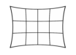
Let’s start with the simplest and probably best-known principle of composition. I have written a full article on this topic because it really deserves a closer look. To clearly understand the “rule of thirds“, imagine dividing your image with 2 horizontal lines and 2 vertical lines. You then get 9 equal rectangles and 4 strong points.

It is generally accepted that the human eye is naturally drawn to these lines and points of intersection. The general idea is to compose the scene in front of you using these elements, allowing you to create a harmonious and pleasing image. In the photo above, I deliberately placed my wife on a strong point in the bottom right of the frame, while positioning the horizon almost along the lower horizontal line.
Use leading lines and curves
I think this is one of the most important tips for improving your photos. In almost every scene or situation in front of you, you will find lines or curves. You may not notice them at first because your eye is not used to looking for them, but they are definitely there.
Of course, in some areas and situations, they are quite obvious. I’m thinking in particular of architectural photography or seaside horizons. The general idea is to look for these lines and curves when taking pictures, as they help guide the viewer’s eye through the image.


We also read images through these elements, because they guide our eyes toward a strong point. You can, and even should, combine this technique with the rule of thirds.
The two photos above are deliberate examples using lines in the landscape. In the photo of the black sand beach, your gaze starts at the bottom right, on the pebble beach, then moves toward the opposite side, at the top left, along the horizon line, before finally returning to the rocky islet with the two trees. The image is well balanced.
In the other photo, the dirt road in the foreground leads the eye toward the back of the image, in the direction of the ocean.
Place your subject in a frame
When we start out, we do not necessarily think about this, but you can absolutely choose to highlight your subject within a natural frame that is already present in the scene. It might be an opening in the vegetation, a half-open door, a tunnel entrance, in short: many different things.
The idea is to naturally guide the viewer’s eye toward your subject while placing it within a wider frame. As an example, here is a photo of a beach I took on the island of Moorea, in French Polynesia. In a place like this, a beach photo can easily become very ordinary, if I may say so. I wanted to try something other than a basic “beautiful white sand beach” shot, so I deliberately framed the beach through the palm foliage. The eye is also guided by a leading line, the yellow tip of the palm leaf, starting from the top left and drawing you toward the bottom right.

Show the scale of things
This is another tip I use very often, especially in landscape photography, which I personally love. Depending on the scene in front of you, you may be able to show the scale, vastness or immensity of a place. Try to visually express what you feel when you look at it.
One example among many: a photo I took in French Polynesia on the island of Maupiti. On the way out of the village, there is a huge basalt cliff, about 80 meters high, perhaps even higher. When you are standing at its base, it is quite difficult to judge its size and then convey that in a photo. During a boat trip on the lagoon, I was lucky enough to see it from farther away.

So I deliberately wanted to emphasize it by adding a sense of scale: the little house you can see at the bottom left of the frame. I wanted to convey the scale of the cliff by removing as much of the sea in the foreground as possible, because it did not add anything. A wider photo with much more sea in the foreground would not have had the same impact. You will also notice that placing the house in the extreme bottom-left corner balances the image perfectly with the imposing cliff in the extreme top-right. We’ll come back to that below.
Fill the frame
This is often an issue when you are a beginner: you tend to compose too wide. As a result, either you do not really have a subject in your photo, or your subject is too small to stand out. The image then loses impact, does not really say anything and your subject does not dominate the frame.
You should see this principle as one possibility, not as an absolute truth. Of course, you can also do the exact opposite by placing your subject alone, lost in the middle of a vast space, to show the immensity of a place, for example.


In both examples above, the subjects are framed very tightly to completely fill the frame. No space is deliberately left around them. You will notice that, even with very different subjects, leading lines and the rule of thirds can still more or less apply.
Balance the photo
As mentioned above, another very effective principle in composition is to deliberately place a secondary subject opposite your main subject, especially when the main subject is positioned on a strong point according to the rule of thirds.

This photo may seem insignificant at first glance, but I only managed to get exactly what I wanted after several attempts. I had noticed the waves forming in the foreground and the boat in the background on the lagoon. As you can see, the boat is roughly placed on a strong point of the image, with the horizon on the horizontal line of the rule of thirds. To balance the photo, I deliberately wanted to place a small wave on the diagonal opposite my subject. To reinforce the composition, you can also see the leading line created by the edge between the sea and the sand, starting from the bottom right corner of the image and guiding the eye to the wave, then to the boat.
Playing with symmetry
This is a classic composition technique that goes against several of the points mentioned above. With some subjects, especially architecture and buildings, you can find perfect symmetry. Use it to create balance in your photo.


I took the photo on the right at the foot of the Petronas Towers in Malaysia. Here, the subject works perfectly when centered, just like the architectural photo on the left.
Beware of disturbing elements
This is more a piece of advice than a major principle in itself. Very often, you focus on the subject in front of you. However, you should not forget all the elements around it. Sometimes you only notice them when you get back to your computer, but unwanted elements can easily spoil an image.

These are distracting elements on the same plane as your subject. They can make the image quite difficult to read. To avoid this kind of thing, you need to move, walk around the subject and adjust your position so that these elements are not in the frame. If they are in the background, you may still be able to blur them later. We’ll talk about that below.
Here is an example of an old photo taken when I was not yet paying attention to my compositions. I probably wanted to photograph the landscape with the beautiful color of the water in the foreground.
Unfortunately, there is a bit of road sticking out on the left, which slightly spoils the image, even if it was not exactly a masterpiece to begin with…
Patterns, textures and shapes
I have deliberately grouped these three elements together, although I could write a full article on each of them. When we talk about patterns, we immediately think of repetitive subjects that can create an impression of infinity in the image.
Textures are everywhere in everyday life. They can be old wooden boards on a building, cracked ground in Africa or the roughness of a leaf highlighted through macro photography.


Finally, geometric shapes are also a great way to create balanced photos. The photo above, showing a detail of a door, is a good example of a triangular shape, reinforced by perfect symmetry.

Playing with contrasts
To strengthen your compositions, you can also play with contrasts. This can mean contrasts in color, light, shapes or size. Color contrasts are often used in macro photography to make the subject stand out.

Light contrast is, for example, closely linked to backlit photography. It is particularly common in street or reportage photography, where certain parts of the image may be deliberately dark, or even black, in order to highlight a correctly exposed subject.
Isolate your subject
This is a classic composition technique, and it often works very well with the rule of thirds, depending on the subject. The goal of this type of composition is to leave space in front of your subject. As a general rule, this technique works especially well with living subjects, whether people or animals.
Usually, a person or animal will tend to look in one direction. If your subject is looking to the right, you can place it on a vertical line on the left side of the image, leaving space in the direction of its gaze. This makes the image more pleasing and highlights the idea that the subject is “looking ahead”. You can also do the opposite on purpose, placing the subject at the edge of the frame in the direction of its gaze, to create a feeling of being stuck or trapped. The two examples below show the general idea.


Play with the depth of field
I’ll end this article with one last technique that can clearly improve your compositions. Depth of field is one of the major tools for making your subject stand out. By playing with aperture in particular, you can isolate your subject with a shallow depth of field.

The goal of this technique is to isolate your subject as effectively as possible by making it stand out against a blurred background. You can refer to my article on aperture in photography to understand how this setting affects background blur. I’m also finishing an article about how to create beautiful background blur…
A short conclusion on the subject. All these practices and rules are a very good starting point to help you improve your compositions and, therefore, your photos. It is not about applying them blindly, but rather about giving you general ideas based on the way photographers work. Once you have mastered these practices, you can then have fun with them, either individually or by combining them.
Of course, other techniques exist to improve your photo compositions, but if you already keep these ones in mind, you should definitely be able to take better photos.
Come on, grab your camera and try them out right now! 🙂
See you soon,

Written by Sylvain PONS
I've been passionate about photography since 2010, learning as I went along. Today, I dedicate myself to guiding others in their choice of camera gear and sharing a variety of tips to improve their photography skills.
Despite our care, a mistake may have slipped into this article. If you find any, please don't hesitate to let us know so we can correct it as soon as possible and keep our information up-to-date!